
 I didn't misspeak. Half. Certainly makes class warfare and the debate over the role of social services in America stink of a conflict of interest. This past week, Center for Responsive Politics released their most reports that crunch the 2012 personal finance disclosures to tell us that 268 of 534 members of Congress are north of $1M. Our wealthiest? Rep. Darrell Issa (R-Ca), who was worth around $474M last year. This is great for playing a fun game... what are your Representatives and Senators worth? I found out that my Senator Mark Warner has millions to the tune of 8 figures. And at a minimum, to answer my own semi-question, we can at a minimum gawk at their wealth, and watch to see how that impacts their votes. And perhaps, an extended analysis through some pleasure reading. Did you hear about Lawrence Lessig's new book? Here's a little excerpt to wet your whistle. 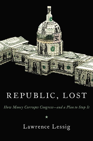
0 Comments
 I have frequently looked at election results, events in D.C., stories on the evening news from around the country and wondered, Who are we? It seems we are a people constantly bereft of history, of a compass that guides and explains why we do the things we do. I know, there is a ton of historical explanations out there as to why we are the way we are. I wanted to highlight some of the information that has come to my attention as of late. 1. Colin Woodward's American Nations. I saw this book at Costco a while back and passed it up. I am kicking myself in the tush, because I have read articles... listened to interviews... and seen his map all over the place. I put this on my facebook page recently, and a friend of mine from back home in Northern Ohio pinpointed the very same sentiment I have had traveling throughout the Great State of O-H-I-O. Depending on how far south you go, it's like passing through another world. (Which may explain this great infographic about Ohio and the 2012 election.) 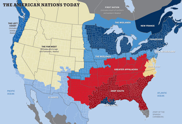
2-4. The WaPo's Washington: A World Apart. If we can't reach an understanding of what makes America tick based on culture, surely it has to be based on social class and income inequality. I like this infographic because it allows you to drill down to your zip code and compare median income with those incomes all around you... or far, far away. If that doesn't complete the picture enough for you, what about a map that details local usage of federal welfare benefits? Or how the tax burden has changed over time?
Have suggestions? More places to wax philosophic on all things American culture & political socialization? |
Photo via Flickr/Ted Eytan
Archives
September 2017
Categories
All
|
 RSS Feed
